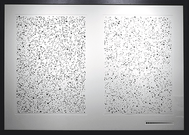

The statistical height and weight distributions of the US population (in 2000) are comparatively mapped in these drawings. The size of each dot correlates to a specific data point. The forms are randomly distributed to yield the overall compositions.
Early data abstraction work (Shoes, Yellow Dots, Height & Weight) was done with a combination of C & MEL (and tons of raw data). They were then built and rendered with early versions of Maya.